Anthem Review: 4 Ups & 9 Downs
4. The User Interface Is Clunky & Frustrating

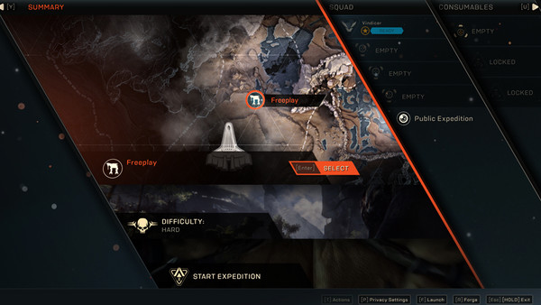
If the technical issues weren't troubling enough, Anthem also proves further infuriating with its awful UI design. The game's menus are thoroughly over-designed, favouring glossy aesthetics over basic function for the most part.
You'll often find yourself nested within four menus, requiring you to hit the back button four times just to get back to the game, while there's no clear logic to the layout, making even something as simple as choosing your mission type a chore to figure out.
An intuitive UI is extremely important when it comes to maintaining a healthy player-base over time, but it's an active slog getting things down in Anthem.
Worst of all, you need to go back to the hub world in order to access the Forge, where you can examine and customise your loadout. And if that's not ridiculous enough, it's also hidden behind one of those pesky loading screens.