Dead Island 2 Review
True Next-Gen Visuals & Incredible Level Design

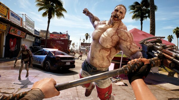
Right from the opening credits this title lays out its impressive wares and utterly wowed us with graphical fidelity and supremely emotive voice acting and motion capture. Playing on the ultra settings on PC I was able to see heatwaves shimmer off of baking tarmac, minute scratches on the hundreds of abandoned vehicles, and individual chunks of brain matter fly off into the distance courtesy of a well-placed mace to the side of a zombie's head.
Aesthetics aren't everything in a game, but Dead Island 2 has them in spades and it's so easy to fall in love with the 10 distinct areas you'll fight your way through thanks to the team approaching each as its own separate visual project.
At first the idea of ditching the prior open-world design in favor of larger "levels" might seem like a step back, especially in a gaming market so driven by open-world tropes, but what Dead Island 2 is able to deliver is a concise message for each area that is injected with purpose. In turn, each environment feels unique, packed with specific detail that either conveys a mood or individual stories (something which open world games struggle with).
Whether you're scrambling through garish architectural monstrosities in the posh area of Bel-Air or slumming it in the sewers beneath them, each section delivers a different visual and tonal motif, allowing for the team to surprise the player over and over.
Special praise has to go to Monarch Studios, as the ability to roam through different film and TV sets with zombies matching those areas made for a hugely enjoyable sequence.
[Continued on Page 3]