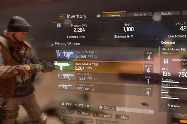
It's been apparent since the beta that The Division's UI could really use some work: upon starting the game, players are inundated with so much information and so many menus that it takes a fair few hours to actually adjust to the layout of everything. It's a mind-melting information overload and, even once you get used to where everything is and what buttons they're mapped to, it still feels clunky and unintuitive. Inventory management is particularly cumbersome for the standards of most similar games, matchmaking arguably requires far more button pressing than it should, and sorting through the abundance of items on the map can prove time-consuming. Yes, there's no easy way to organise the game's massive wealth of content, but it just doesn't always feel like it follows basic logic: it feels counter to the ease of use we've seen in other RPGs.
Stay at home dad who spends as much time teaching his kids the merits of Martin Scorsese as possible (against the missus' wishes).
General video game, TV and film nut. Occasional sports fan. Full time loon.