The Evolution Of Video Game UI
Design

When having no HUD at all is too little, the next thing developers think about is how to present it. In the early days, the typeface within the sprite sheet of a game cartridge or arcade machine was usually all there was to play with, but as the medium matured, the user interface was given much more flair. The aesthetics of the title you're playing would bleed into the design of the UI. Are you playing a horror title? There's a good chance your UI might look a little dishevelled, and splattered with dry blood. Playing a futuristic shooter? Expect lots of neon and digital typefaces.
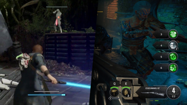
This theme of keeping the HUD design within the 'house style' of the title was heavily prominent through the late nineties and 2000's, with it starting to fade away as titles matured further. Though titles such as Call of Duty: Black Ops 4 may attempt to have a fitting HUD for its zombies mode (which it had done for the past titles), it was boisterous, messy, and ugly. On the flipside, Star Wars Jedi: Fallen Order went for a much more hyper-minimal approach, not as in-keeping to the Star Wars aesthetic we've been used to in previous titles set in a galaxy far, far away. Minimalism in the UI space can make a title more cinematic, explosive racer Split/Second opted for minimal HUD, while keeping it front and centre as to not distract you too much from a toppling building.