The Evolution Of Video Game UI
Menus
Before you've even had the chance to grab your first coin, load your weapon, or even put your seatbelt on, you're actually wanting to start the game itself. Where do you always begin? The main menu- provided the game doesn't just throw you in the deep end as soon as you put the disc in. Sometimes the menu need be nothing more than 'Start', 'Options', and 'Quit'. You may get a hyper-simplified title screen reminiscent of those from the NES era, or you'll have something fully rendered, that could even act as the first shot of the game- looking at you, God of War.
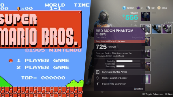
As console gaming became a lot more popular over the years, menus were built with controllers in mind, simplified buttons with sub-menus available, rather than dumping everything on one screen, making traversal harder with a thumbstick. A mouse is always quicker than a controller in multiple ways, and this even led to the mainstream menu, be it to simply start the game, or rummage through your inventory, bringing back the use of a cursor, even on a console. Bungie's Destiny spearheaded a cursor-traversed menu in modern games, and the influence can be felt through everything from Call of Duty to Dead by Daylight. Why even have a menu remove you from gameplay entirely? Have it appear around you in The Division, or as a translucent panel ahead of you in Dead Space. You could also be wearing the bulk of your menus on your wrist in the Fallout series, or most of it could lie within your backpack in The Last of Us.