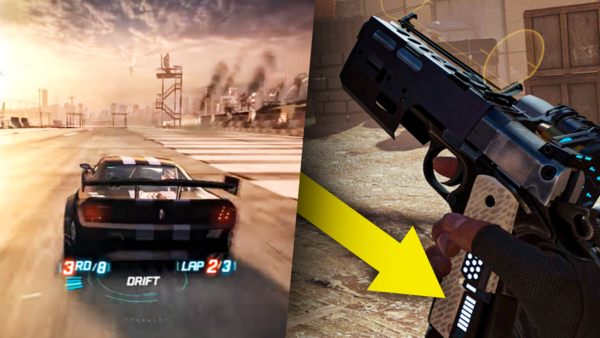
The Evolution Of Video Game UI
So What Do You See?

Video games have come a long way. From not needing to tell you much about what you're doing, to giving you a quasi-encyclopedia to read within the options menu. To this day, developers are experimenting with ways to convey information to the player in the prettiest, most effective, or least distracting ways possible- or even trying to achieve all three at the same time. The information we have needed from the games we are playing has evolved over time. First we needed to only know scores. Now, we're needing to know how much HP a particular enemy has left, and the weak spots we need to hit in order to take it down, all within a time frame we need to be informed of too.
It's a balancing act within development that has entire teams of programmers, artists, and directors, all working to ensure a experience that we almost don't realise is happening. Here's to you, the UI/UX designers. You are the people putting the proverbial cherry atop a fantastic game. Or, you could be souring the whole experience with iffy design decisions and a horrible typeface to boot. What examples of video game UI do you admire, and which video games do you think have the worst looking HUD of them all? Black Ops 4, I'm looking at you.