The Last Of Us Episode 2 Review - 7 Ups & 1 Down
4. The Stunning Set Design & Cinematography

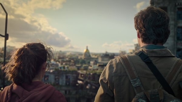
For as good as the characters are in this episode though, by far the most impressive one is the city itself.
By transplanting the visuals from the game directly, The Last of Us immediately sets itself apart from other post-apocalyptic shows and movies.
On the one hand we’ve got the direct adaptations from the game joyously re-created in live-action. We’ve got the museum, the hotel, and of course those slanted skyscrapers framing those unbelievable wide compositions.
It all looks perfect, and it helps that the environments are packed with game references that’ll make rewatching the show more rewarding. If episode one felt visually a little bit horror show 101 at times, this hour kicked things into another gear.
However, props have to go to Neil Druckmann’s direction and particularly Ksenia Sereda's cinematography. Not only do individual shots look incredible, but the way they tell the story, framing Joel and Ellie closer to together as they start to connect, is superb. Small details, like the look Joel gives the broken watch daughter gave him after a beautiful moment spent looking out at the skyline with Ellie, serve as great ways to show the pair warming to each other without words, and what Joel himself risks by letting him become fatherly with another young girl. Big ups all around here.