WWE 2K20: 10 Reasons To Be Worried
4. It's Graphically Identikit

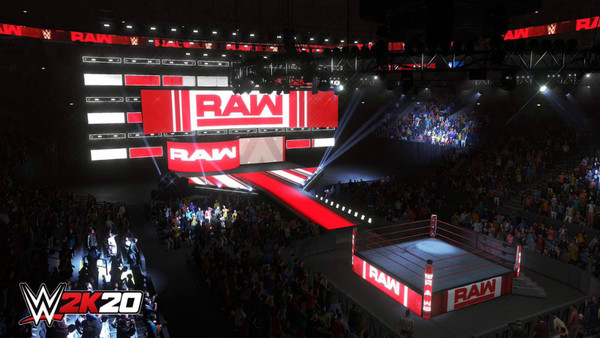
Before reading this entry, try out a mini-experiment. Close your eyes halfway, peek through at this screenshot of Raw and ask yourself how impressive it is. In all likelihood, you'll agree that it looks highly realistic and could pass, at first glance, for the real deal. Problems only arise when wrestlers bound into frame or close-ups of fans in the stands are shown.
They're the same as 2K19.
Hair still sticks to skulls like it's been coasted in plastic, eyes stare into the distance like they belong to undead freaks from Days Gone, fans leap around like they've been supping too much Monster and everything has an artificial sheen when viewed up close. This is identikit graphical work to what's come before.
Although it could be argued that lighting has been refined and some character faces are better (look out for comparison shots on YouTube), not enough has changed. This is, regrettably, still the same template 2K has been using for years now. When the f*ck are they going to upgrade it properly?