10 Reasons The Division 2 DESTROYS Anthem
2. The User Interface (Mostly) Makes Sense

A user interface can make or break a game of this type, and there's little denying that Anthem's UI is a disaster.
A cluttered mess that's not even visually appealing to boot, it's far more confusing to navigate around than it should be, and there doesn't appear to be any particular logic to its layout.
Ultimately it smacks of a developer who desperately needed to hire someone better-versed in UI design, because with a game this seemingly "complex" (but only superficially so, really), there's no excuse for making things a headache for players.
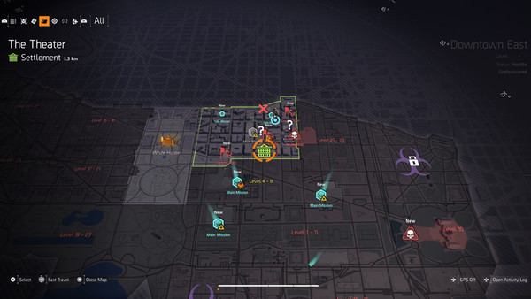
In total fairness, The Division 2's UI is far from perfect, but it is massively superior to Anthem's all the same.
It doesn't take more than two button presses and as many seconds to view your gear, matchmaking can be accessed almost as fast and the menu generally balances neat aesthetics with ease-of-use exceptionally well.
Basic things like switching out equipment and navigating the game map aren't sluggish chores as they are in Anthem, and in games that already demand so much of your time, that's vitally important.