10 Ways Watch Dogs 2 Is Already Better Than The Original
8. A Far Bigger, Brighter And More Visually-Appealing Setting
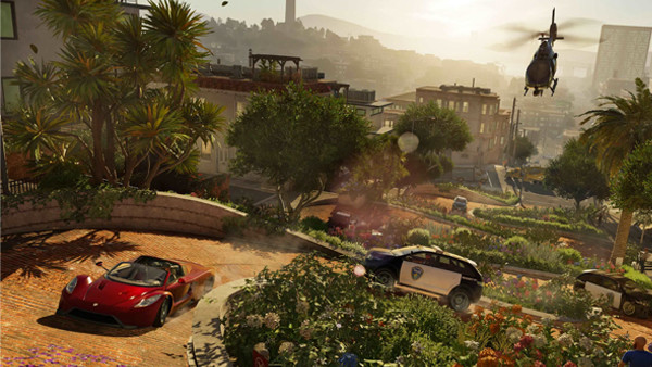
It's clear that the dreary nature of the Chicago setting in WD1 was designed to match the campaign's melancholy tone. Unfortunately, the washed-out colouring, similar to GTA IV's visual style, only served to hurt the game's presentation and led to the game world appearing dull. Now, much like GTA V, it seems WD2 learned to embrace the power of California's bright color scheme.
There's something immediately engaging about this new visual style and its emphasis on bright colors. It helps make the world design and details stand out further as the brightness helps accentuate every aspect packed into the open-world. It makes the concept of driving around and just exploring for the sake of it appealing, whereas that took a bit more convincing in the depressingly-gray Chicago setting.
Every part of San Francisco also has tons more to do, with Silicon Valley and Oakland offering specific neighbourhoods and views that'll see Marcus interacting with many different kinds of people from different backgrounds. WD1's Chicago setting didn't allow for many different boroughs or unique uses of location, so here's hoping this sequel can use the oft-used California setting in a way never seen before.