13 Iconic Video Games That Were Sold With Hilariously Terrible Box Art
4. DOOM (2016)

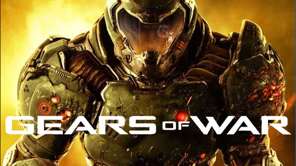
Concerns that id Software's genre-defining series wouldn't transition well into the 21st century were commonplace prior to its launch last year. As it turns out, we were right to worry, not about id's ability to modernize DOOM's gameplay, but rather, it's totally limp, bland box art.
Do bear in mind, that the original game's front cover is one of the finest ever envisioned; expecting the current-gen revival to go one better was always going to be nigh on impossible, but for the pendulum to swing this far in the other direction? Unthinkable.
So generic is DOOM's unidentifiable front, Photoshop hobbyists took it upon themselves to make a game out of replacing the DOOM logo with that of other franchises, a shining example of which you can see below.
