7 Secrets Of Dishonoured 2's Development
7. Polygons Vs. Art-Style: Which Wins?

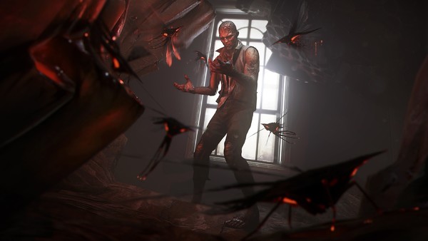
To this studio, it’s a fight of Street Fighter proportions. A tussle that Arkane’s lead designers take seriously. What makes a game so beautiful or visually striking? In a presentation on the development of Dishonoured 2, lead designer Sebastien Mitton made the stance that, “polygons are not art.” Take that, pixel-minded developers.
The team were set on the idea that graphics are not – should not - be the exemplary focus of a video game’s visual presentation. Instead, it’s the handcrafted art-style that should be commended. They worked bloody hard on it too.
For over four years, since the original Dishonoured was released, Arkane were hard at work on the sequel. Clay models of characters from the Dishonoured world are proudly displayed as you make your way into Arkane’s studio. They were commissioned by the team partly for an exhibit in Paris, but also to satisfy their inscrutable thirst for a complete 360 approach to their art style. They even considered creating wooden location models, but logistics made them decide against the venture.
Evidence of their dedication to the visuals of Dishonoured 2 is ubiquitous in their studio. Concept art adorns the walls of the studio - from character models of ugly bruiser guards and narrow-faced aristocrats to Corvo and Emily Kaldwin’s defining material characteristics. All emblazoned on the wall by the team like true art-style championing patriots.
It wouldn’t be overblown to call it breathtaking.