9 Ways Bethesda Can Fix Fallout 76
4. Streamline The User Interface

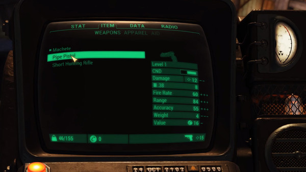
This is probably one of the tallest orders on the list, though also one of the most pressing issues facing the Fallout franchise considering how long the user interface has been a clunky, unintuitive mess.
Yes, it's incredibly uncommon for a game to patch in a wholly overhauled interface post-launch, but Fallout 76's menus are so frustratingly slow, unresponsive and needlessly involved that they clearly require a major rework.
For starters, maybe give players a Rockstar-style map in the corner of the screen which can be expanded and contracted with a single button press, free of the 3+ second wait often needed to view the map at present.
That's to say nothing of the Pip-Boy menu itself, navigation of which feels like more work than it should. Given the countless efficient AAA menus Bethesda could look to for inspiration, is it really acceptable that they're just sticking to their lousy guns here?
Sure, Fallout 4 was a huge critical and commercial success despite its annoying interface, but in an online game where timing and expediency is often crucial, a molasses-slow series of menus really isn't good enough.