Anthem: 10 Major Fixes It Desperately Needs
3. Streamline The User Interface
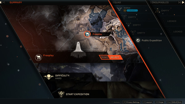
It's not remotely exaggerating to say that Anthem's UI is really quite hideous. Doing something as simple as switching between expedition types is an aesthetic headache and not even basically intuitive in the slightest.
Nothing flows naturally, and it's a clear case of developers who have no idea how to design an easily accessible menu just cramming everything in wherever possible.
The menus may seem slick and glossy on first appearance, but they're entirely superficial, with little attention paid to the most important aspect - ease of use.
Having to peel away layers of nested menus to do basic things is extremely annoying, and makes the overall experience even more busy-work than it already is.
Advertisement