Battlefield 2042 Review: 6 Ups & 6 Downs
4. The UI Is Awful

Battlefield 2042 doesn’t make the best first impression, and part of the reason why is the headache-inducing UI design.
An overwhelming mess of colours and button inputs, just figuring out how to find a game to begin with can be confusing.
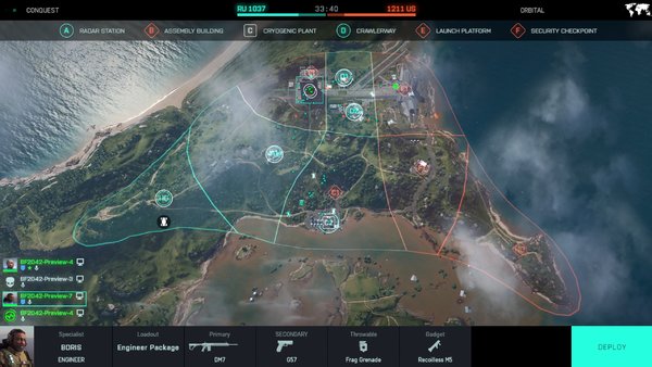
The HUD during gameplay is just as bad as well. It’s difficult to get your bearings or understand what each symbol means. Likewise, the HUD doesn’t convey simple information clearly or elegantly. Throw up the map screen and you’ll have trouble figuring out where the hell you are on it. Icons and colours blur together, making it far more difficult than it should be to parse what’s going on.
Combine this with a large banner at the top every time you take sector, and the whole thing feels a little bit… oppressive. It’s not immersive, and it’s certainly not clear, so what function does it serve?