Borderlands 3 Review: 6 Ups & 4 Downs
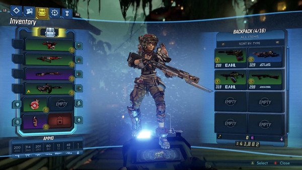
3. The Same Old UI (With Even More Issues)

Borderlands 3 is a very cluttered game. Cluttered on-screen elements, various statistical readouts, tons of quests, weapons, items, customisable components, loot tiers, etc.
You name an action game staple, Borderlands has it in droves.
And were this the first entry, I could forgive not designing a decent UI around comparing items, juggling quests and pinpointing precisely where to go at any given time.
This being the third - and otherwise best - one yet though, the UI problems stick out like a sore thumb.
Things like not being able to view all your objectives on the map at once, leading to re-running the same areas because something you missed was the key to a side-quest. Things like the menus themselves lacking and cutting out audio while you transition from inventory to skill tree.
Things like not putting other quest info on the mini-map, rendering the full map in an awkward 3D style, or filling the screen in-game with pop-ups over weapons that all conflict with one another.
At this stage it feels like Borderlands needs to do a Witcher 3 - admit what the devs initially put time into was wrong, and overhaul the entire thing.