Marvel Ultimate Alliance 3 Review: 7 Ups & 6 Downs
6. Environments And Character Models Are Beautiful

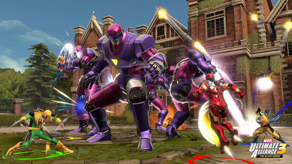
What's perhaps Marvel Ultimate Alliance's most obvious strength is just how beautiful it is. From the opening cutscene with the Guardians of the Galaxy in space, it's clear that the artists have gone to great lengths to capture the vivid colour pallet and striking designs of the comic-book source material.
Unlike the oddly drab second game, every location (even ones we've seen many times before, like Avengers tower) pops with colour and life. Even better, because the game is ostensibly a dungeon crawler, the levels themselves provide a visually impressive backdrop to your beatings. It helps that most of the levels are themed around a specific part of the Marvel universe as well - whether that's Xavier's Mansion, full of X-Men iconography, or Spider-Man's high-security prison, The Raft - but MUA is packed with rich landscapes to fight through that
The heroes you're fighting as are equally impressive as well. The angular designs are a joy to simply stop and admire, whether it's a pitch-perfect take on Spidey's red-and-blue suit, Wolverine's yellow comic costume or Ghost Rider's flaming skull. There isn't a dud design in the entire roster.
Everything is delivered in a bold, semi-cell-shaded style that pops, and the well-directed cutscenes that introduce new characters are practically comic-book splash pages in motion.