WWE 2K17 Review: 6 Ups & 7 Downs
2. The Reworked User Interface

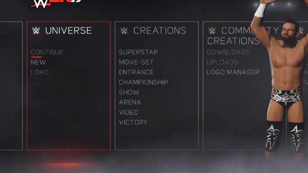
It's safe to say that, for all its flaws, 2K17 touts an incredibly slick and intuitive user interface, making menu navigation easier than ever, while Universe mode's move towards a more TV-esque UI just makes it feel that much more immersive.
Hell, even the menu screen has clearly had a ton of effort put into it, with random, fully-rendered wrestlers emerging out of smoke to strut around in the background. It's a nice touch and shows how much thought 2K put into getting the presentation right.
Advertisement