Xbox One: 5 System Features That Must Be Implemented
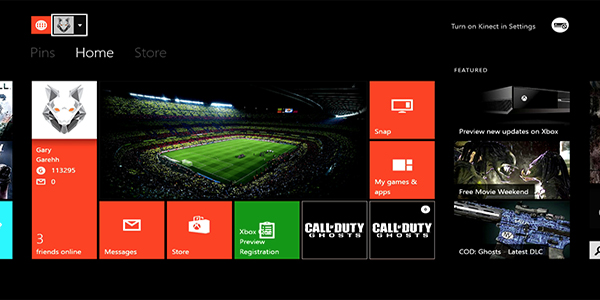
3. G.U.I - Too Much Clutter
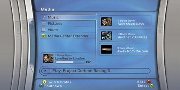
Tiles. Tiles everywhere. I find myself at times reacting to the UI as if I am in Pan's Labyrinth. It just looks so tasteless. That may well be due to the reason we aren't allowed creativity in terms of Themes, but I remember when I turned on my console for the first time with a sigh at what I was looking at. Everything just seems so unnecessarily complex on the Xbox One, with even the most rudimentary of operations being a hassle. Simplicity is the best policy. Your home screen needs to have a simple layout, covering all the bases for what somebody who wants to 'get this' would use their games console...gaming, funnily enough. A personal favourite still remains in the original 360 GUI, which had sliding frames. You have a window for each area of your profile, it didn't look half bad, and allowed customisation.