20 Worst Moments In Modern Doctor Who (According To YOU)
17. The Series 7 Title Sequences
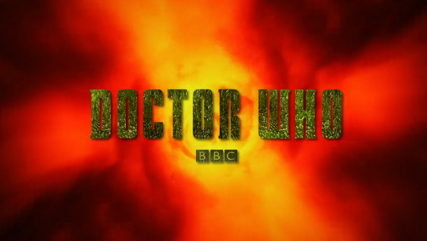
One of the few constants in Doctor Who is the iconic opening title sequence (unless your name rhymes with Peep Mo Floor).
And then there was Series 7A, when they kept changing it every week – part of a bigger plan to market each episode like a blockbuster movie.
The problem was, rather than altering the existing titles from the ground up, they just slapped filters on top of them. As such these five “unique” variants all ended up looking pretty similar, and really really bad to boot, like a cheap knockoff version of the real thing.
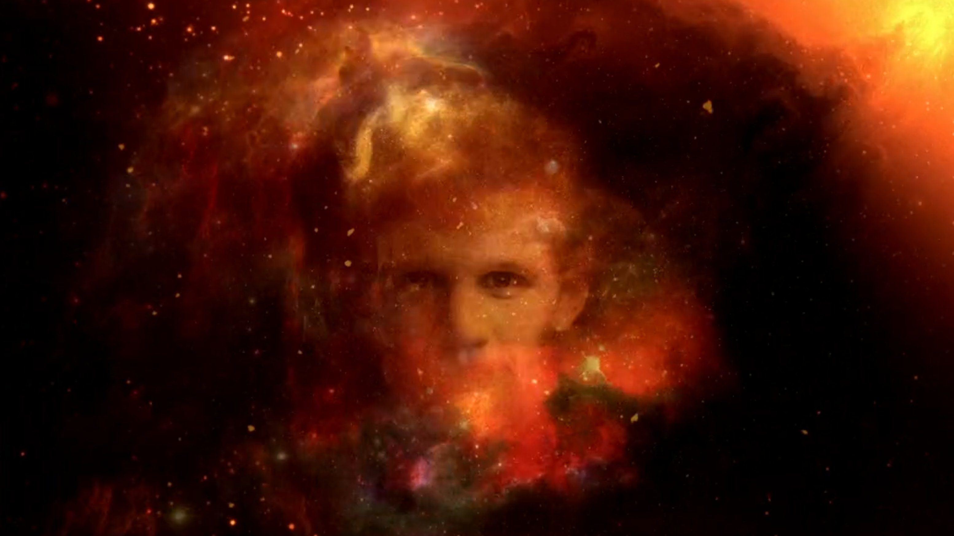
We also got variants of the logo, with a “texture” relating to that week’s episode. Again, it was a cool idea, but they appeared so briefly that you have to wonder whether it was worth it. And some textures were more obvious than others (yes, those are Dalek bumps on the Asylum of the Daleks logo, not just random dots).
We did then get a fully redesigned title sequence for Series 7B… albeit one that was inferior to the 2010-12 version in practically every way. The visuals are more varied, but they’re also less three-dimensional, and way more generic – like a series of stock elements blending into each other.
In summary, this entire endeavour just felt really really half-arsed.